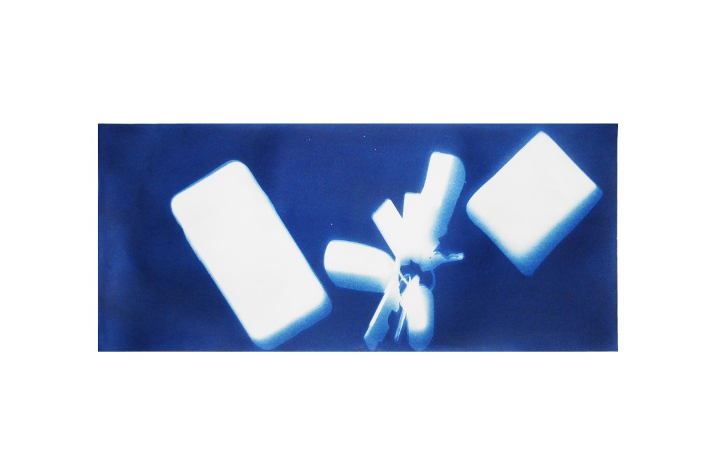
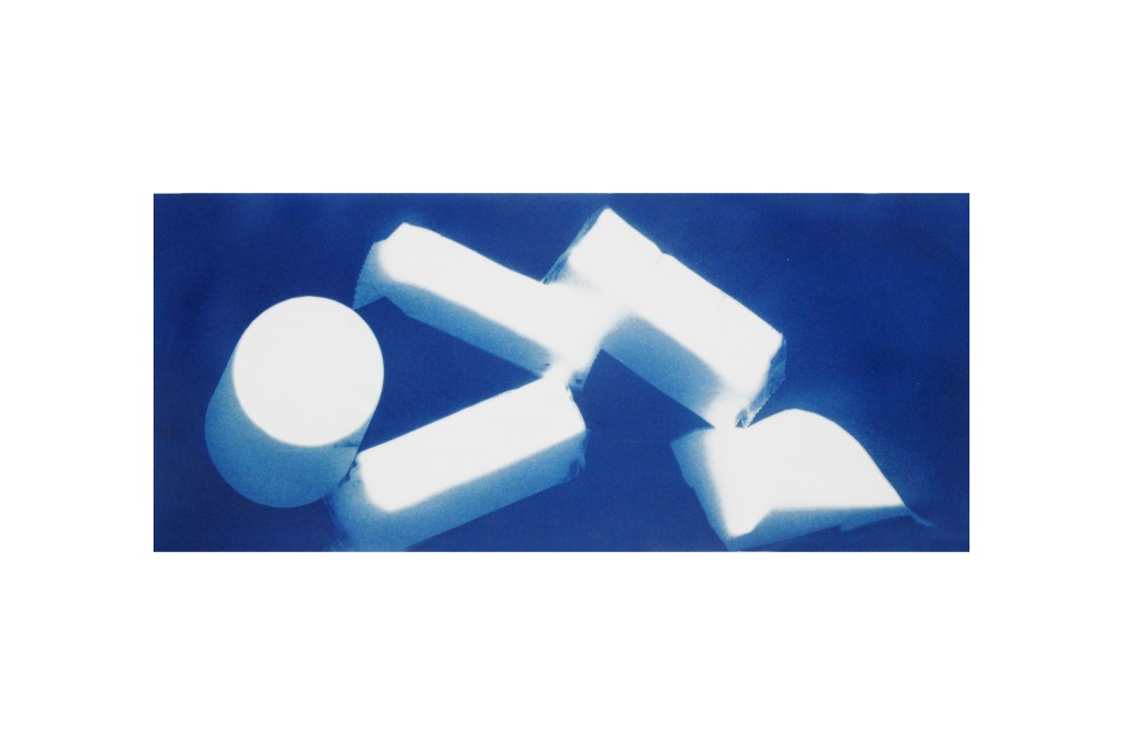
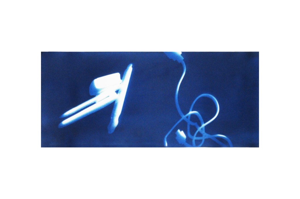
This collection of cyanotypes displays every day grab-and-go items, items you would throw into your pockets or backpack before heading out the door. Each of these items serves a different purpose while some of their importance differs from person to person. I thought it would be interesting to randomly toss each of the times onto the paper almost like emptying your pockets after coming home. This lead to I think more interesting layouts as opposed to purposefully placing each item down.
I want to keep the identities of these objects hidden in order to leave the prints open for more interpretation.
These are all items I use just about daily.
 Daniel Corn SACD
These are very thought provoking, Daniel. They remind me of a TSA screening or an x-ray of someones belongings. Have you seen Paul Robinson’s studio this semester? I feel as though you’d enjoy their work I think what I like most about these compositions is their slight shifts in shadows which make them look like they are falling slowly in an alternate suspended reality. The composition is also very pleasing, the framing is what really nails that suspended feeling.
LikeLike
Daniel, these are really interesting images that you’ve captured. “Low Blood Sugar” is the most intriguing to because you’ve introduced this idea of a heavy rectangular block in the first photo and then you’ve copied and pasted this language in a more chaotic manner in this one (which is cool and more fun to look at). I also think that the composition and framing is good. I don’t think I’ve seen anyone else cut their paper like you have and I think this aids in the way someone views these images. The cropping almost gives a tighter feeling to the photos, but I don’t necessarily think that’s a bad thing. Great job!
LikeLike
I like the consistent use of objects in the transfers, they are very strong and took well to the paper. the layout of the objects is very interesting. I would also recommend, like Emily said, to take a look at the X-rays of Paul Robinson’s studio. They look very similar to yours and i think you would enjoy looking at them. 🙂
LikeLike
Really interesting composition, Daniel. One thing that catches my attention is the consistency of the work through out the three pictures. I did really enjoy the second image. The title is very provocative but at the same time the shapes that are shown are very volumetric and easy to read. Also, the way in which they are displayed in a playful setting makes it pleasant to observe.
LikeLike
Hey Daniel, these are some of my favorites that I have seen. I think the way the objects have imprinted onto the paper is perfect, and I think since I can’t tell what every object is, it adds to the overall intrigue of the images. I also really enjoy the shadows and how they help make every item pop and give them almost some vertical volume like they’re reaching off the paper.
LikeLike